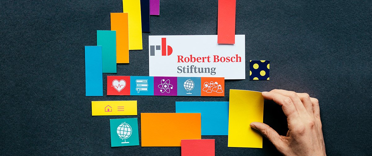
A New Look for the Robert Bosch Stiftung
The Robert Bosch Stiftung GmbH has refined its look: A more varied color palette, emotional photos, and concise use of text and graphics reflect our new self-image.
The new look was prompted by the further strategic development we have pursued in recent years. In addition to placing our focus on three substantive themes, this process has also changed the culture of the Foundation, with the result that openness, diversity, and trust play a greater role than ever. The Foundation has become more modern. Hence, the new look couples the Foundation’s tradition-rich origins with a contemporary appearance.
We have updated our logo and extended it to include a figurative mark. The rb is a clear acknowledgment of our founder, Robert Bosch, and at the same time, a compact, recognizable symbol that will not become lost in a sea of digital images.
In parallel with the evolution of our corporate design, we have reworked the concept of our communication channels. The Foundation website now features new narrative formats that present vivid impressions from its project work.
The first issue of our magazine ‒ also newly revamped – has appeared as well. The title New refers to more than just the design and layout of the magazine. Above all, it has to do with social innovations, the promotion of which has been one of our primary concerns over 50 years. This will consistently remain in our focus going forward.
The principles according to which the Robert Bosch Stiftung GmbH has operated since its inception – reliability, professionalism, independence, and cooperative thought and action – will continue to be integral elements of our work.