Logo
The logo is the visual ambassador of our brand and therefore the most important element in terms of brand recognition. There are four different color versions of our logo as well as a smaller version for particularly small media. The logo must not be altered or redesigned, neither as a whole nor in parts.
Standard version
Small version
Grayscale version
Single-color version
Negative version
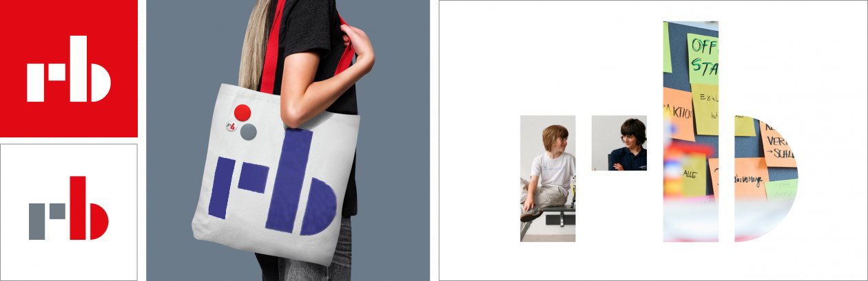
Figurative mark
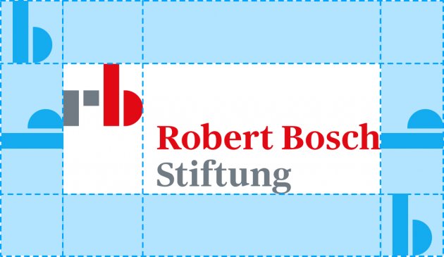
Protected area
The protected area is the space around the logo in which neither text nor other graphic elements may be positioned.
The extent of the protected area is derived from the height of the letter ‘b’ in the figurative mark.
Indication of support
For external projects supported by the Foundation, the logo should include the addition ‘supported by,’ if possible, and be placed under the term ‘Supporter’ (not sponsor or the like). Font, size and exact position are at the discretion of the designer and should be adapted to the respective work.
Figurative mark
Examples for illustrative use of the figurative mark
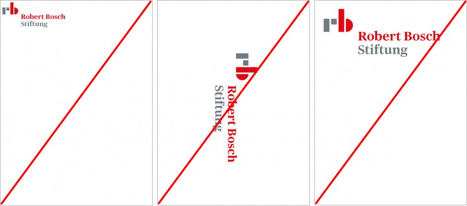
Don’ts
- The logo must not be placed too close to the edge of a format or viewport.
- The logo must not be set vertically.
- The logo must not be too large for the format.
Colors
The Robert Bosch Stiftung's color scheme is as vibrant as the Foundation itself. A variety of primary and secondary colors create a lively appearance with positive tension.
Primary colors
Secondary colors

Primary colors of the Robert Bosch Stiftung


Secondary colors

Farbtonabstufungen im Webmagazin.
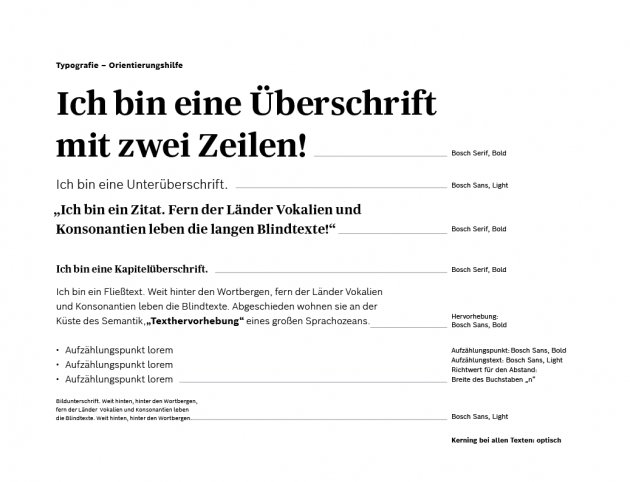
Font
The Robert Bosch Stiftung uses its own corporate fonts, Bosch Serif and Bosch Sans. They are important elements when it comes to the brand’s effect and visualize the Foundation’s relationship to the company of the same name.
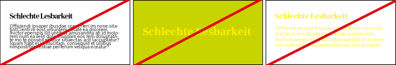
Don’ts
If required, you can request the corporate fonts, Bosch Serif and Bosch Sans, from the contacts for the CD Portal.
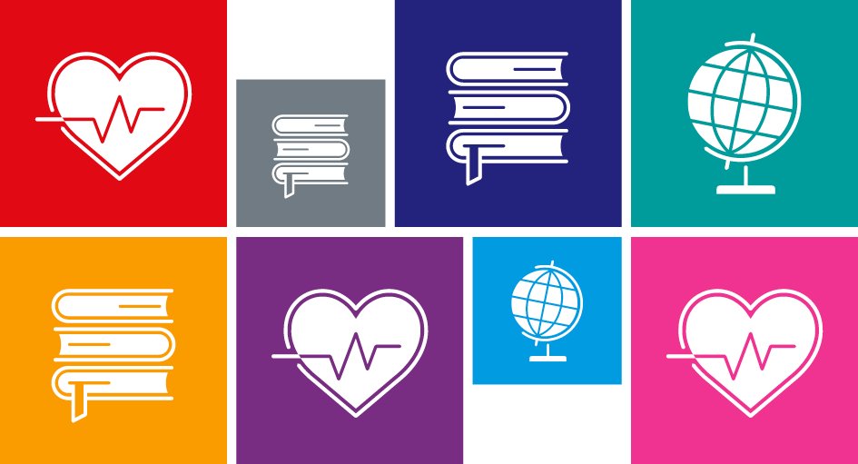
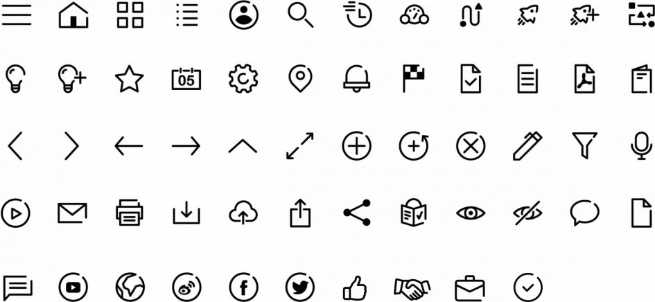
Icons
Icons are means of communication. Contrary to the written word, icons convey their message non-verbally and thus help the observer to gain orientation quickly as well as language-independently. Together with other design elements, they vitalize and structure the corporate design of the Robert Bosch Stiftung.
Overview of support area icons
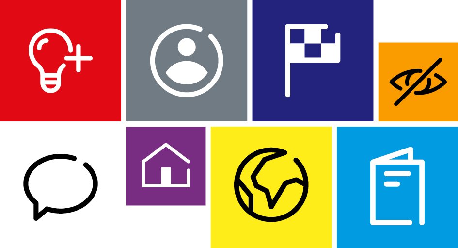
Areas of application for system icons
Don’ts
Overview
Design principle: Areas
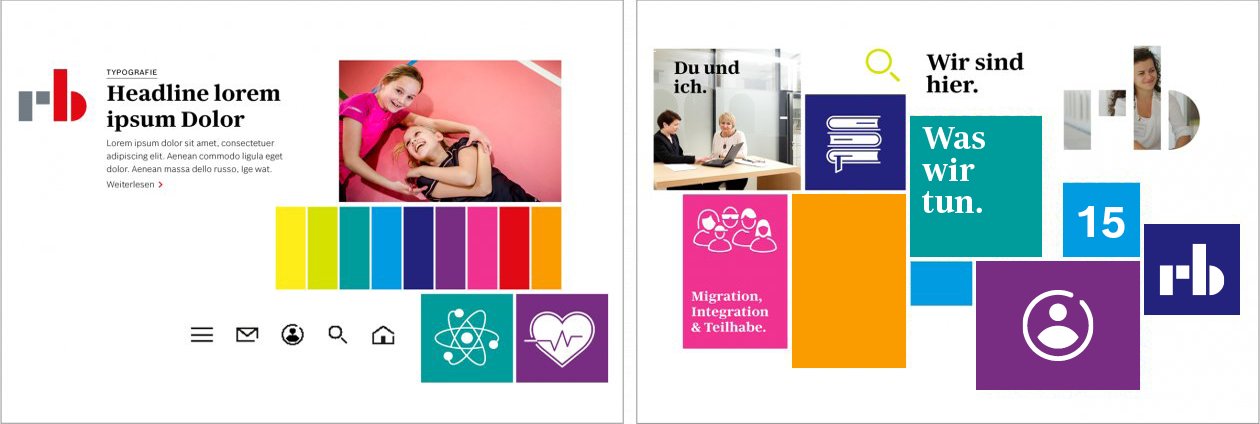
The interplay of the brand-defining basic design principle
Loud and quiet
Nobody has to be loud all the time in order to be heard. The Robert Bosch Stiftung’s corporate design can do both, loud and flashy or quiet and restrained. This way, both young and mature target groups can be reached.
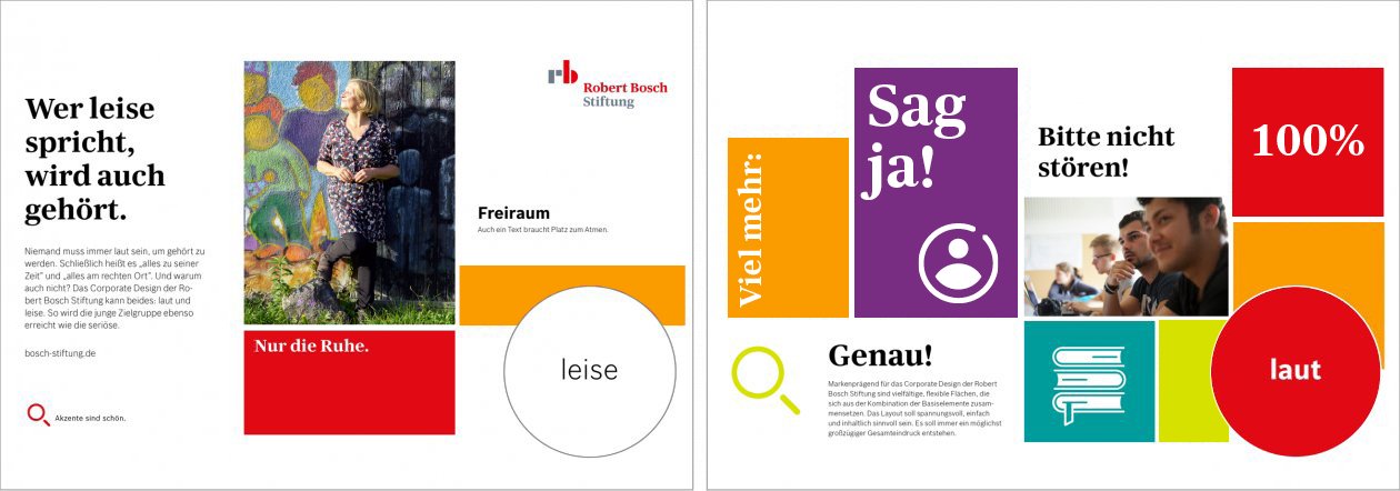
Creative range from quiet, serious layouts to loud, image-focused, colorful layouts
Visual style
The Robert Bosch Stiftung’s visual signature underscores the Foundation’s philanthropic mission by focusing on authentic, human imagery. The Foundation’s different target groups, including potential partners, political stakeholders, media outlets, topic experts, and the general public, require clear, visual communications that are easy to understand and share. As such, we place special value on the consideration of cultural sensitivity and gender diversity.
Corporate story-telling: Show & tell
The Foundation’s support work centers around projects with a particular commitment to one of Robert Bosch’s philanthropic focal points. As such, the visual signature showcases authentic situations and/or people who seem approachable and genuine. Our images tell real stories that allow viewers to immerse themselves in the action –whether at a distance or close up.
Genuine, moving, and truly human moments are the hallmarks of our visual language. We want to use journalistic-style images, privileging documentary-style photography, to boost our content’s credibility.
Cutouts
Perspective
Composition
Focus
Light
Colors
The visual world of the Robert Bosch Stiftung
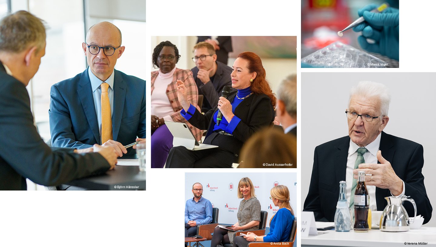
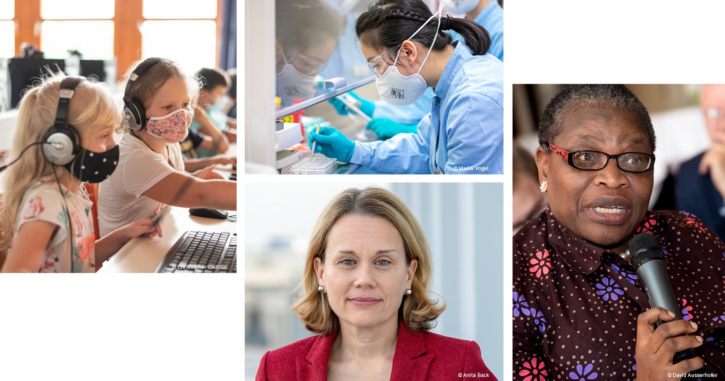
Image sections
Elements for a brand-shaping and independent visual language
Authentic people
Atmosphere of natural light
Clear colors and contrasts
Blurring to create a focal point
Natural, unposed moments
Storytelling
Don’ts

No overtly fake gestures or facial expressions, no advertising-like aesthetics or artificial backgrounds, no excessive lighting, color filters, or flat, low-contrast images.

No cropping to center staged moments, no desaturated or black and white images or exaggerated perspectives, no unflattering angles.

No inappropriate behavior or depictions of dangerous situations, no shots which reveal personal or confidential details or sensitive data, and no pigeonholing: be conscious of both gender and cultural diversity in small group shots.
Briefings for photographers
It is important to plan a photo shoot by providing a specific briefing to the photographer. This ensures that the created images correspond to the visual language of the Robert Bosch Stiftung and will later fit harmoniously into the overall presentation of the corporate design.
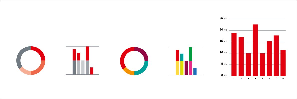
Diagrams and charts
Successful diagrams and charts give viewers an easy understanding of areas of expertise that would otherwise only be accessible by studying large numbers of datasets. Infographics shed light on complex facts and correlations.
At the Robert Bosch Stiftung, diagrams and charts can be created in one of three visual styles, each with its specific level of detail.
Category 1
Category 2
Category 3
Examples of use Category 1
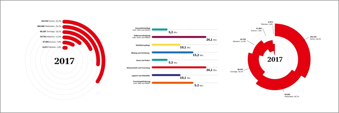
Examples of use Category 2
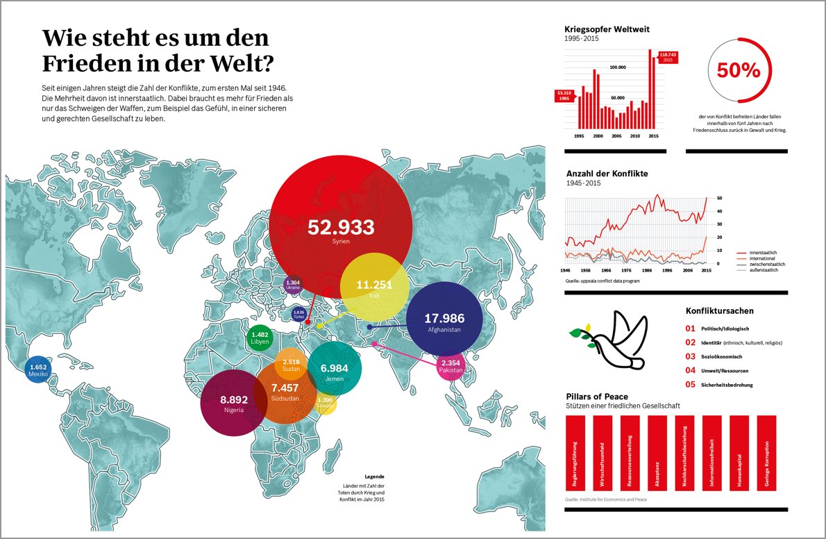
Examples of use Category 3