Styleguide for print media
The brand appearance provides a multitude of design options and the prerequisite for all individual elements to form a coherent whole. In the following, you will find the basic guidelines for the design of brochures, leaflets, etc. and a number of successful examples for inspiration.
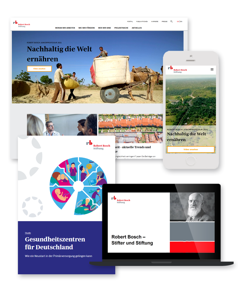
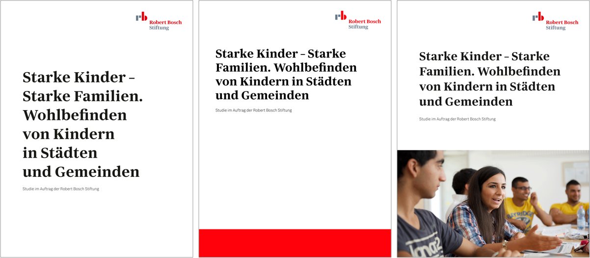
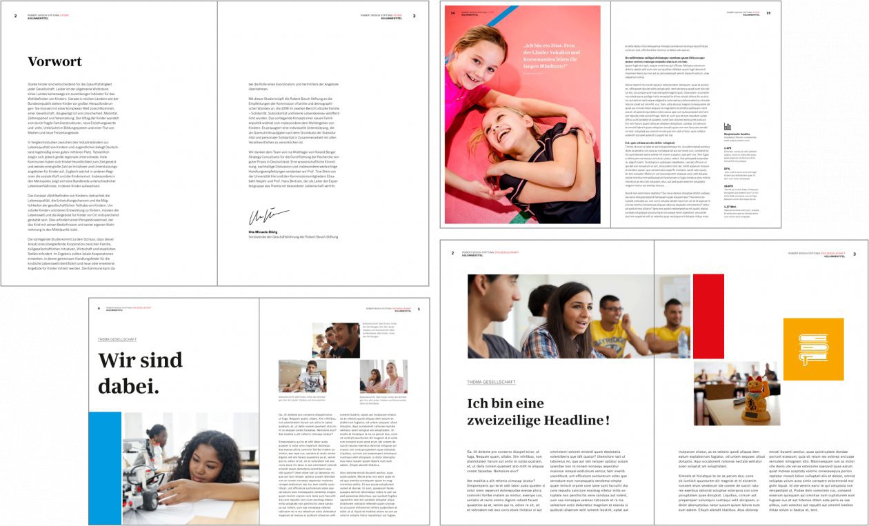
Publication samples for inspiration
![[DE Copy] Print Beispiel Innenseiten 02](/sites/default/files/styles/im1260/public/images/media/2021-08/8.4_Publikationen_Fl%C3%A4chenprinzip_Anwendungsbeispiele4.png.jpg?itok=nHA0wry4)
Sample pages for DIN A4 and DIN Long publications
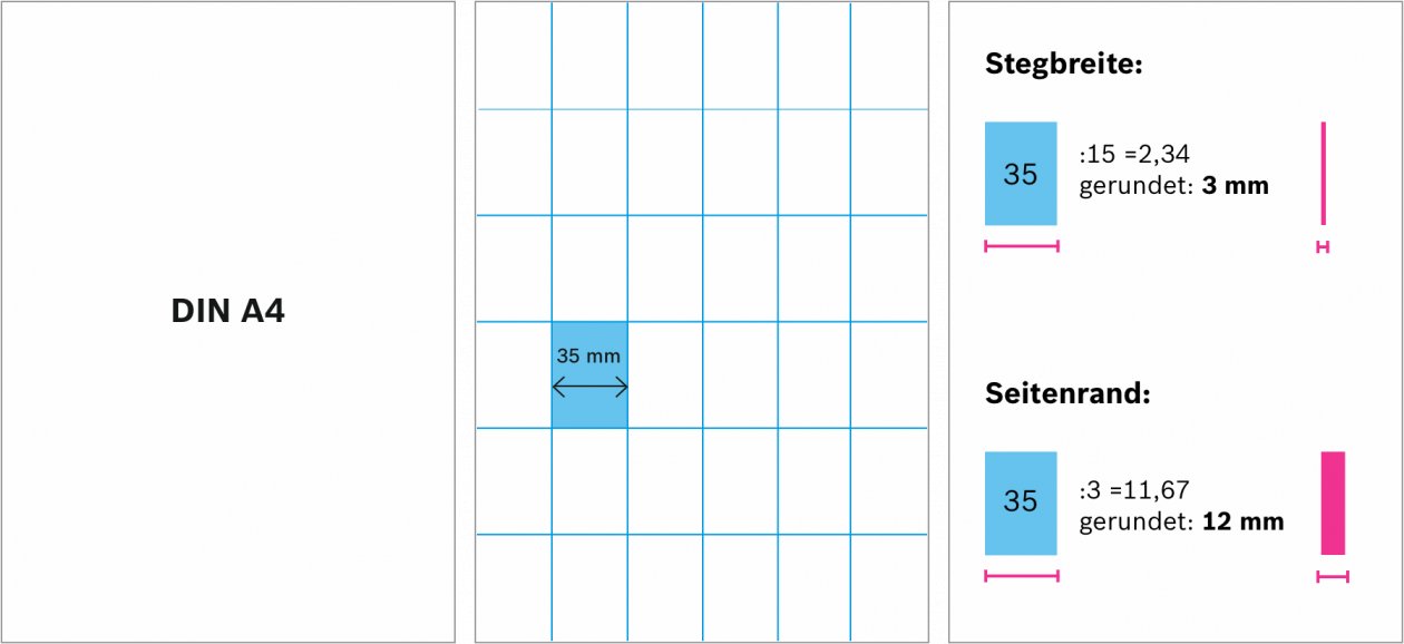
Background Principle
To structure content clearly, the layout is divided into background areas in which typography, buttons, icons, patterns, images, etc. can be placed.
How the background principle works
Formats may be filled completely or with margins. Publications may be text- or image-heavy. Layouts may be very simple or complex, with different column widths. All publications are based on a background principle, which is applied as follows.
![[DE Copy] Flächenprinzip Sechserteilung](/sites/default/files/styles/im1260/public/images/media/2018-01/sechserteilung.png.jpg?itok=J_qiHW0v)
Dividing a format into six areas
![[DE Copy] Stege und Ränder](/sites/default/files/styles/im1260/public/images/media/2018-01/stege_und_raender.png.jpg?itok=6am2eTHV)
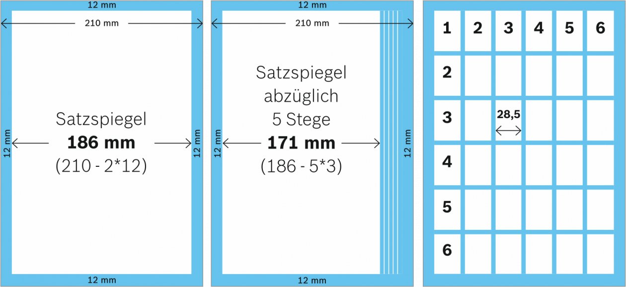
Calculation of the white-space between areas, as well as the optional side margin.
![[DE Copy] RBSG Flächenprinzip Ausnahmen](/sites/default/files/styles/im1260/public/images/media/2018-01/rbsg_ausnahmeregelung_raender_0.png.jpg?itok=S6P0Etvn)
For extreme portrait and landscape formats as well as for double-sided media, the margins can be multiplied by a factor of 1.5 or 2.
Step-by-step calculation (example)
See here for a sample calculation for the common DIN A4 format. The background principle is always calculated in the same way.
Overview of common DIN formats
Flexible Handling of Background Areas
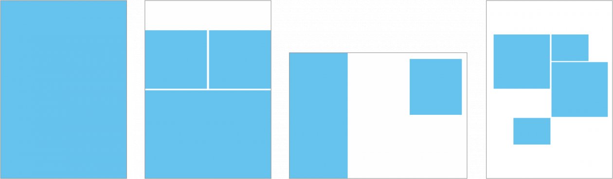
![[DE Copy] Beispiel Flächenprinzip 3](/sites/default/files/styles/im1260/public/images/media/2018-01/beispielflaechen_02.png.jpg?itok=OCHy5qWK)
Background principle (examples): Bleed areas and areas with page margins can be combined.
Hierarchy of print media
With a louder and more emotional design and address, you will reach a younger target group. To reach an older or more distinguished target group, choose a calmer and more fact-based approach. Define the purpose of your medium and design your publications accordingly. The choice of the target group directly impacts the design.
![[DE Copy] Hierarchisierung Printmedien](/sites/default/files/styles/im1260/public/images/media/2018-01/rbsg_hierarchisierung.png.jpg?itok=nzlclk-V)
Example: fact-based address (left) versus emotional address (right)
Fact-based
Emotional
Paper
The Robert Bosch Stiftung uses Lessebo Smooth Bright paper with 1.2 times the volume for stationary and publications.